Tuesday, 4 December 2007
Edited raster 9)

Edited Raster 8)
Raster Graphics 7
Friday, 30 November 2007
Edited Raster 6)
Tuesday, 27 November 2007
Edited Raster Graphics 5)
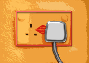
Got heaps of different versions of this plug/socket ...but i decided to stick with this one as it looks best.
First of all I used burn and dodge tools on the plug and the side of the socket. Then i used the cutout filter. I then imported the layer from a previous attempt, which was the plug and wire, but changed the effect of them. I added in a rectangular box(just the outline) and used an effect to create the outline for the socket.
Also used skew to fix the shape of the image and make it straighter than it was.
Edited Raster 4) ...
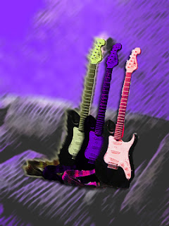
For this image I first used the magic wand tool in Photoshop to select the guitar, copied and pasted into a new layer. I then duplicated this layer twice and moved the guitars apart from each other.
For the background i used the Sumi-e filter and then put the opacity down. Copied the background layer and pasted it into a new layer called background1, and then went to the original Background and made it white.
Used hue, saturation and contrast on the guitars, and used the smudge tool on the green guitar.
Im quite pleased with the result.
Friday, 23 November 2007
Portfolio Vector Graphics :: Trace a Bitmap. . .
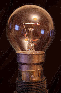
I opened the file in Adobe Illustrator, selected the image then clicked on
Object > Live Trace >Tracing Options
Then selected "Comic Art" preset, and changed the Mode to colour, and the Max Colors to 200. Then clicked on trace and saved the image as .ai file then opened this file in Fireworks and used the sub selection tool to select different ares of the image, which shows it is a vector graphic.
Saved the file again in Fireworks in PNG format. Saved traced image as jpeg also.
Tuesday, 20 November 2007
Tuesday, 13 November 2007
TIFF files...
instead of clicking on the link and clicking on "Save", click on "open" where it will open in Photoshop and then go to Save for Web and Devices then save it as a jpeg high and reduce the size to whatever is suitable... Much quicker!!!
Edited Raster Graphics 3)
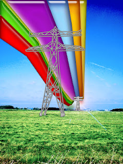
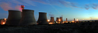
2)Pylon.
Edited in Photoshop.
Decided to make this brigh and vibrant just to see what effect it would give...
Added in lens flare filter behind the small pylon, which is a cpoy of the big one but then I used the scale tool to resize it. The "rainbow" bit was created by line tool to then joining each section together and filling it with a different colour and renaming each layer to what colour it is. Then I used the "web styles" style to give them the effect they have.
Used "levels" for the sky and the grass.
Traced the lines on the pylon using the "line" tool and then merged the layers together to create 1 layer, which I then added a "tuxedo" style to.
It reminds me of a Skittles advert somehow..... but im quite pleased with it :D
Friday, 9 November 2007
1st storyboard vector graphics
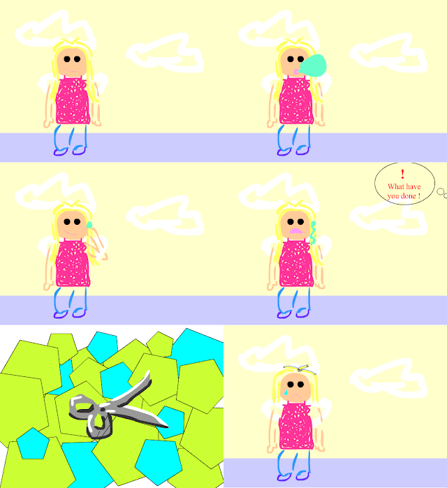
Used Flash to create this.
This animation is based on me and my sister... I didnt have time to spend adding in an extra person so just left it as it is..! The random bit in the middle of the animation is supposed to be scissors... my ace drawing skills...!
Found that if you export the movie while something is selected, it will show the selected bit in the exported file! Note to self.. make sure you de-select things first before exporting them..
Click on image to open the animation.
Tuesday, 30 October 2007
Friday, 12 October 2007
Tuesday, 9 October 2007
Raster Graphics 1)- Manipulated

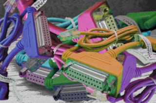
1) Cables.
For this i created 3 layers. There was the background which I made blue, then I added the image on top and duplicated the layer so there was 2 images. For one layer I reduced the *opacity*, and changed the *filter* to "cutout". Then for the layer on top i just selected the wires with the "magic wand" and cropped it to just the wires, and left its colours etc the way they were.
This image ties in with the TEAM ELECTRICITY \m/ topic, and is it colourful aswell so could possibly be used on the website hmm...
Tuesday, 2 October 2007
Updated Folio Work...
Friday, 28 September 2007
Portfolio Work....

"Business" Card. Quite pleased with how this turned out!

This is my "Teddy bear T-Shirt " thing.. didnt have a clue what to put on it so just went for something original lol..
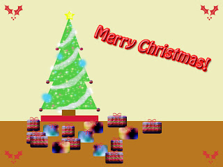
The Christmas/Festive card or whatever it was supposed to be...
i dont like it so going to edit it..maybe start again and do something completely different!
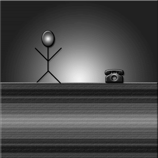
The "animation" gif thing. i dont know why it doesnt move...it is supposed to (it does on photoshop) but...?? Hmmm..

"Personal Label" its not very interesting but i like the colours and it gets the point across..name and class....


